Example Home Assistant Dashboard
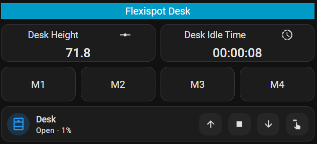
On here we are using the custom button-card to show:
- The current height of the desk.
- How long the desk has been idle for.
And using the ‘Mushroom Cover Card’ to render the height cover.
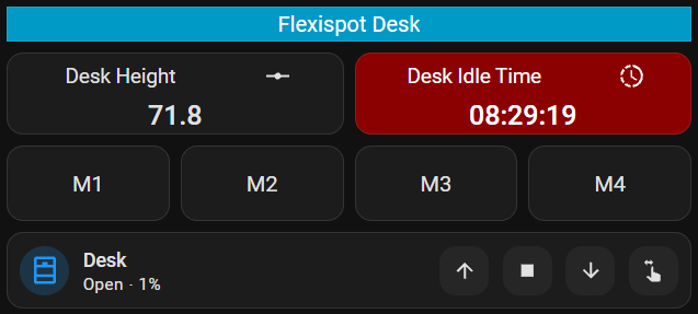
After 30 minutes with the desk at sitting height the background changes colour on the ‘Desk Idle Time’ card to indicate its time to standup.
This uses these HACS addons:
- https://github.com/custom-cards/button-card
- https://github.com/piitaya/lovelace-mushroom
Yaml for this:
type: grid
cards:
  - type: custom:button-card
    name: Flexispot Desk
    template: section-heading
  - type: custom:button-card
    entity: sensor.bedroom_1_deskup_pro_flexispot_desk_height
    show_state: false
    show_label: true
    show_icon: true
    name: Desk Height
    icon: mdi:ray-vertex
    size: 25px
    numeric_precision: 1
    label: |
      [[[
        var value = states["sensor.bedroom_1_deskup_pro_flexispot_desk_height"].state;
        return parseFloat(value).toFixed(1);
      ]]]
    grid_options:
      columns: 6
    styles:
      grid:
        - grid-template-columns: auto
        - grid-template-rows: 1fr
        - grid-template-areas: |
            "n i"
            "l l"
      card:
        - height: 60px
        - font-size: 15px
        - padding: 2px
      icon:
        - height: 20px
        - width: 20px
        - margin-right: 10px
        - margin-top: 0px
      name:
        - margin-left: 0px
        - margin-top: 0px
      label:
        - font-size: 20px
        - font-weight: 500
        - margin-top: 0px
        - margin-bottom: 0px
        - padding-top: 2px
  - type: custom:button-card
    entity: sensor.bedroom_1_deskup_pro_flexispot_idle_time
    show_state: false
    show_label: true
    show_icon: true
    name: Desk Idle Time
    icon: mdi:progress-clock
    size: 25px
    numeric_precision: 1
    label: |
      [[[
        var value = states["sensor.bedroom_1_deskup_pro_flexispot_idle_timestamp"].state;
        return value;
      ]]]
    grid_options:
      columns: 6
      rows: 1
    styles:
      grid:
        - grid-template-columns: auto
        - grid-template-rows: 1fr
        - grid-template-areas: |
            "n i"
            "l l"
      card:
        - height: 60px
        - font-size: 15px
        - padding: 2px
        - background: |
            [[[
              var idletime = states["sensor.bedroom_1_deskup_pro_flexispot_idle_time"].state;
              var height = states["sensor.bedroom_1_deskup_pro_flexispot_desk_height"].state;
              if( height < 80 && idletime >= 1800 ) {
                return "darkred";
              }
            ]]]
        - color: |
            [[[
              var idletime = states["sensor.bedroom_1_deskup_pro_flexispot_idle_time"].state;
              var height = states["sensor.bedroom_1_deskup_pro_flexispot_desk_height"].state;
              if( height < 80 && idletime >= 1800 ) {
                return "white";
              }
            ]]]
      icon:
        - height: 20px
        - width: 20px
        - margin-right: 10px
        - margin-top: 0px
        - color: |
            [[[
              var idletime = states["sensor.bedroom_1_deskup_pro_flexispot_idle_time"].state;
              var height = states["sensor.bedroom_1_deskup_pro_flexispot_desk_height"].state;
              if( height < 80 && idletime >= 1800 ) {
                return "white"
            }
            ]]]
      name:
        - margin-left: 0px
        - margin-top: 0px
      label:
        - font-size: 20px
        - font-weight: 500
        - margin-top: 0px
        - margin-bottom: 0px
        - padding-top: 2px
  - type: custom:button-card
    name: M1
    show_icon: false
    show_name: true
    show_state: true
    tap_action:
      action: call-service
      service: button.press
      target:
        entity_id: button.bedroom_1_deskup_pro_flexispot_desk_m1
    grid_options:
      columns: 3
    styles:
      card:
        - padding: 10px
        - border-radius: 12px
        - font-size: 16px
        - height: 55px
      state:
        - font-size: 12px
        - padding-top: 5px
  - type: custom:button-card
    name: M2
    show_icon: false
    show_name: true
    show_state: true
    tap_action:
      action: call-service
      service: button.press
      target:
        entity_id: button.bedroom_1_deskup_pro_flexispot_desk_m2
    grid_options:
      columns: 3
    styles:
      card:
        - padding: 10px
        - border-radius: 12px
        - font-size: 16px
        - height: 55px
      state:
        - font-size: 12px
        - padding-top: 5px
  - type: custom:button-card
    name: M3
    show_icon: false
    show_name: true
    show_state: true
    tap_action:
      action: call-service
      service: button.press
      target:
        entity_id: button.bedroom_1_deskup_pro_flexispot_desk_m3
    grid_options:
      columns: 3
    styles:
      card:
        - padding: 10px
        - border-radius: 12px
        - font-size: 16px
        - height: 55px
      state:
        - font-size: 12px
        - padding-top: 5px
  - type: custom:button-card
    name: M4
    show_icon: false
    show_name: true
    show_state: true
    tap_action:
      action: call-service
      service: button.press
      target:
        entity_id: button.bedroom_1_deskup_pro_flexispot_desk_m4
    grid_options:
      columns: 3
    styles:
      card:
        - padding: 10px
        - border-radius: 12px
        - font-size: 16px
        - height: 55px
      state:
        - font-size: 12px
        - padding-top: 5px
  - type: custom:mushroom-cover-card
    entity: cover.bedroom_1_deskup_pro_flexispot_height_slider
    fill_container: true
    show_position_control: true
    show_tilt_position_control: false
    show_buttons_control: true
    grid_options:
      columns: full
    name: Desk
    layout: horizontal
    hold_action:
      action: none
    double_tap_action:
      action: none
    tap_action:
      action: more-info